UFC GYM+ App
Duration
7 weeks
Category
Unsolicited Redesign
Project Overview
The Product:
The UFC GYM+ app allows users to check in to a club, book classes, and view their own membership information.
The Problem:
A forgettable interface and usability issues create a negative experience that risks not only lower app usage but lower club engagement as well.
My Goal:
Re-design the UFC GYM+ app, incorporating user feedback for a simple, informative, and intuitive experience.
Research
User findings:
Research started with a simple task: “Find what workout classes are available on Sunday, November 19th.” Users almost immediately experienced a host of pain points, including confusing filters and feedback, incomplete class lists, and unclear class information. The biggest problem, however, was entirely broken functionality:
When users filtered for a date range, whichever date they tapped on was not selected; the one before it was.
Class lists sometimes did not refresh when filters were applied.
The last date in a selected range did not contain class information.
Low-fidelity Wireframes
While the most significant pain points would be fixed in the back end, design improvements would meet the functional and content requirements that are essential for users to reach their goals.
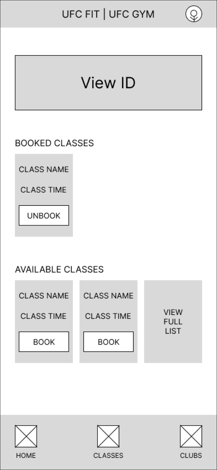
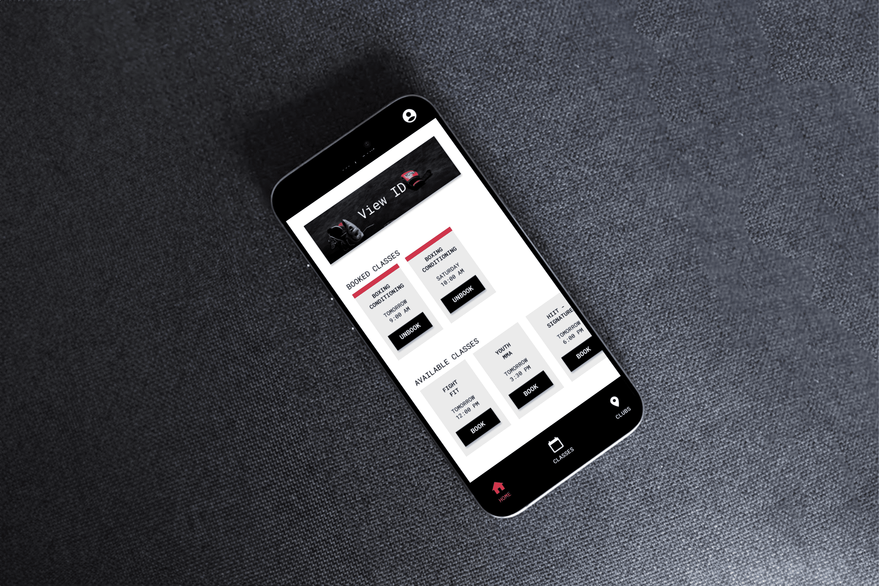
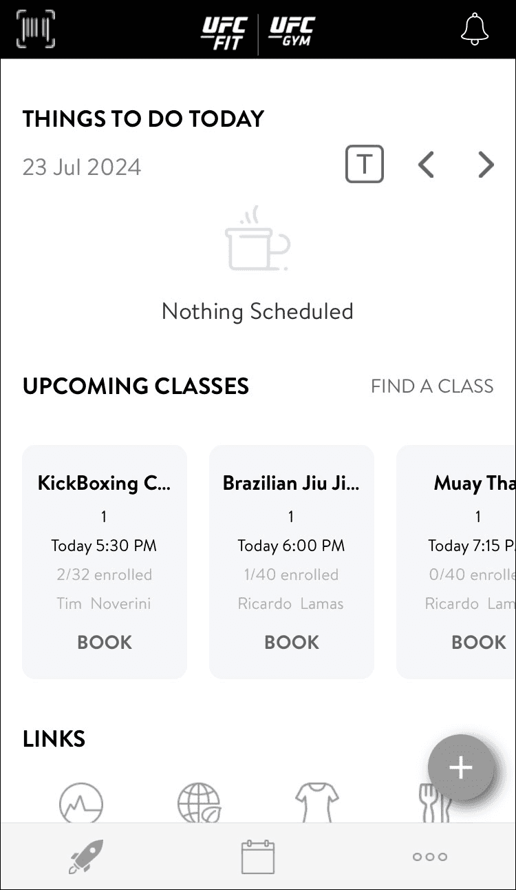
Homepage
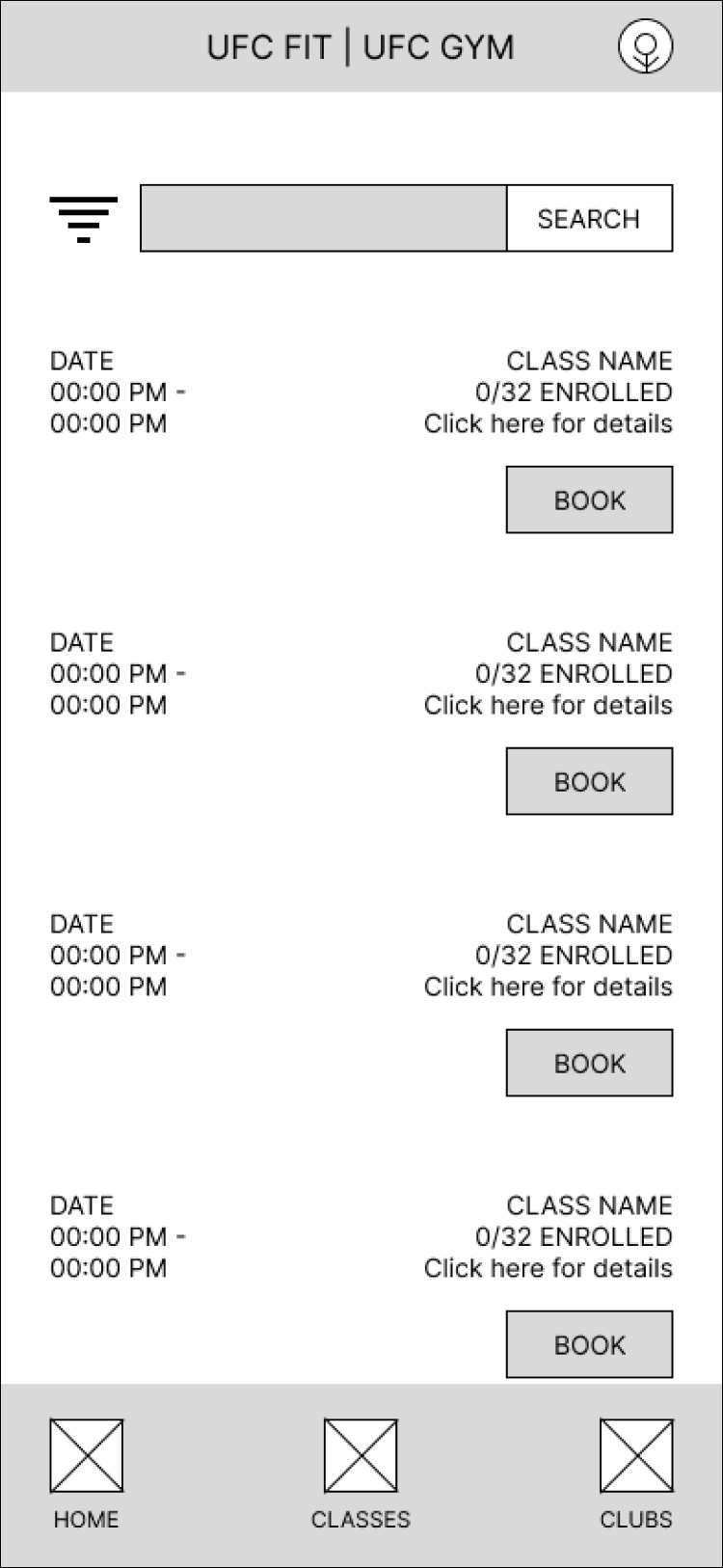
Class list
High-fidelity Wireframes
Homepage rationale:
The homepage was re-designed to prioritize checking in and attending classes:
A “View ID” button was added to grab attention and facilitate quick selection.
Individual class tiles (or cards) were simplified to demonstrate options without reducing the value of other screens.
The navigation was simplified as well, now giving users an always-present way of returning to the homepage, viewing classes, or viewing club information.
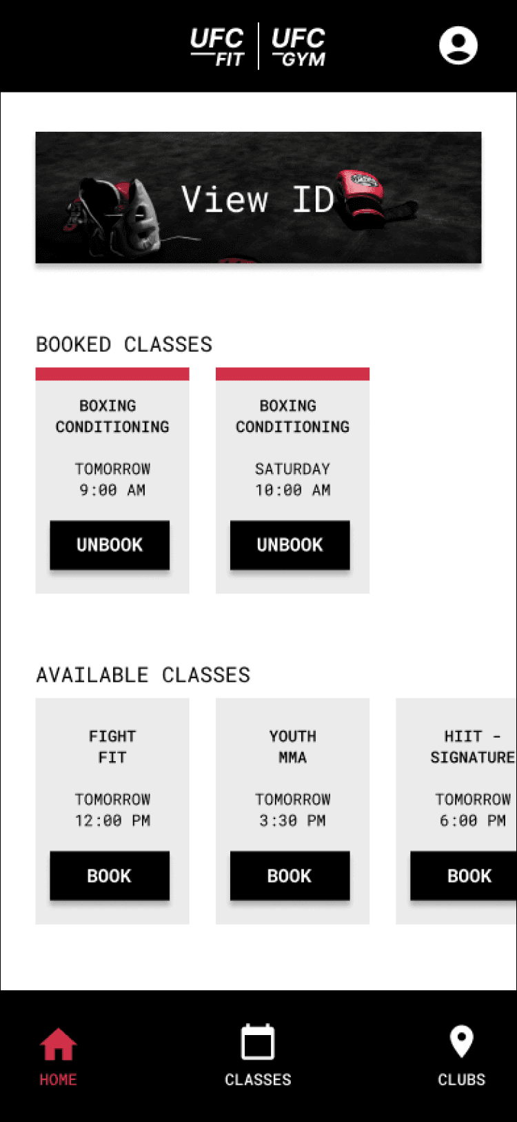
The current homepage (as of 2024)
The re-designed homepage
Class list rationale:
The class list was re-designed to address some of the functionality issues uncovered in testing:
Filter presets were removed to show a full class list.
A search bar was added, giving users an additional choice when it comes to finding a class.
The navigation bar that disappeared in the original app now remained visible, giving users the flexibility to move between screens.
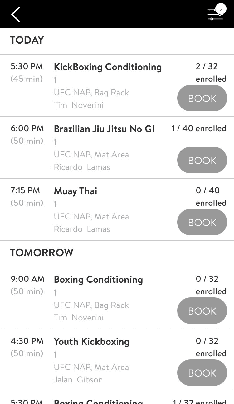
The current class list (as of 2024)
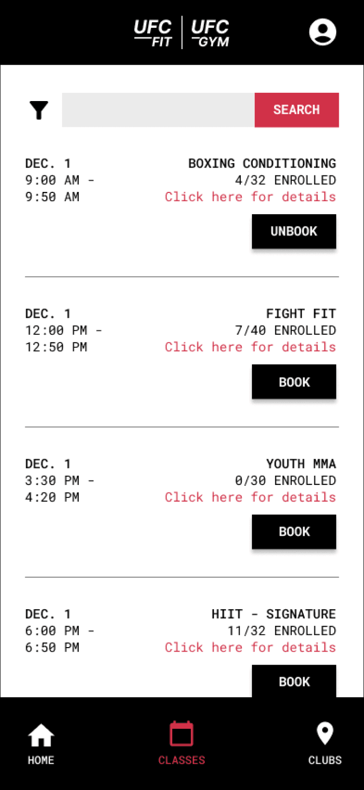
The re-designed class list
Learnings
This was one of my simpler projects, since it involved the re-design of only two screens, but that actually put things into perspective. Even with such a narrow scope, there were multiple functional and content requirements to consider, as well as pain points to address. Throughout it all, I learned that:
Trust is fragile:
A recurring piece of feedback was that users didn’t trust the app. This both reflected the influence of broken functionality and informed my design decisions. Points of reassurance were all the more important to include, as they could build back trust and make the difference between long-term app use or abandonment.
Branding is not (necessarily) a limitation:
Sometimes “re-design” is conflated with “drastic change,” so here I challenged myself to keep UFC’s branding… but make it better. Colors and fonts were used not only to add interest and direct attention, but also to create a cohesive and brand-appropriate look. If anything, the addition of red (with proper contrast, of course!) better aligned with UFC’s branding than the existing design did.