First Gen App & Website
Duration
2 months
Category
Google Certificate Project
Project Overview
The Product:
First Gen is a fictional job search service specifically for first generation immigrants. The service needs a mobile app and responsive website that is intuitive across age groups, language competencies, and technological literacies.
The Problem:
First generation immigrants face numerous barriers to entry when seeking jobs, and existing services don’t provide support across all levels of experience.
My Goal:
Design an app and responsive website (across mobile, tablet, and desktop) that eliminates common barriers like intensive sign up processes, unrealistic requirements, and a lack of immigrant-specific resources.
Research
User findings:
After speaking to fellow first-generation immigrants within my family, I agreed that the job search poses a lot of barriers to entry. Many immigrants don’t know where to begin, let alone how to navigate the oftentimes complicated application process. Some of the barriers we discussed, like required references, influenced First Gen’s branding more so than its primary user flow, but these discussions were essential to better understanding target users.
Competitor findings:
Researching competitors confirmed opportunities to provide better resources and improve accessibility. From inconsistent websites across devices to poor legibility, this research helped me identify market gaps that First Gen could fill.
Click to view the full competitive audit and audit report.
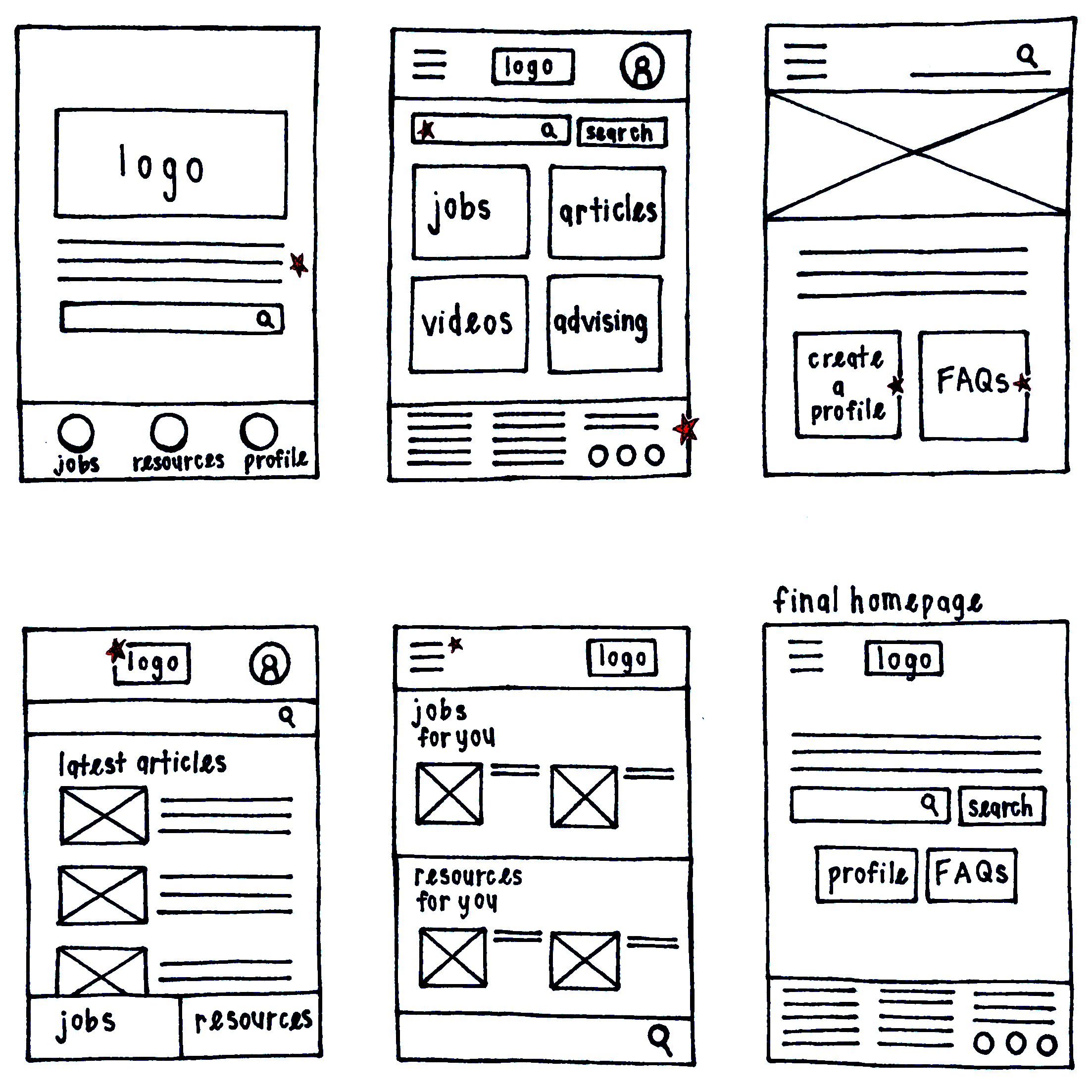
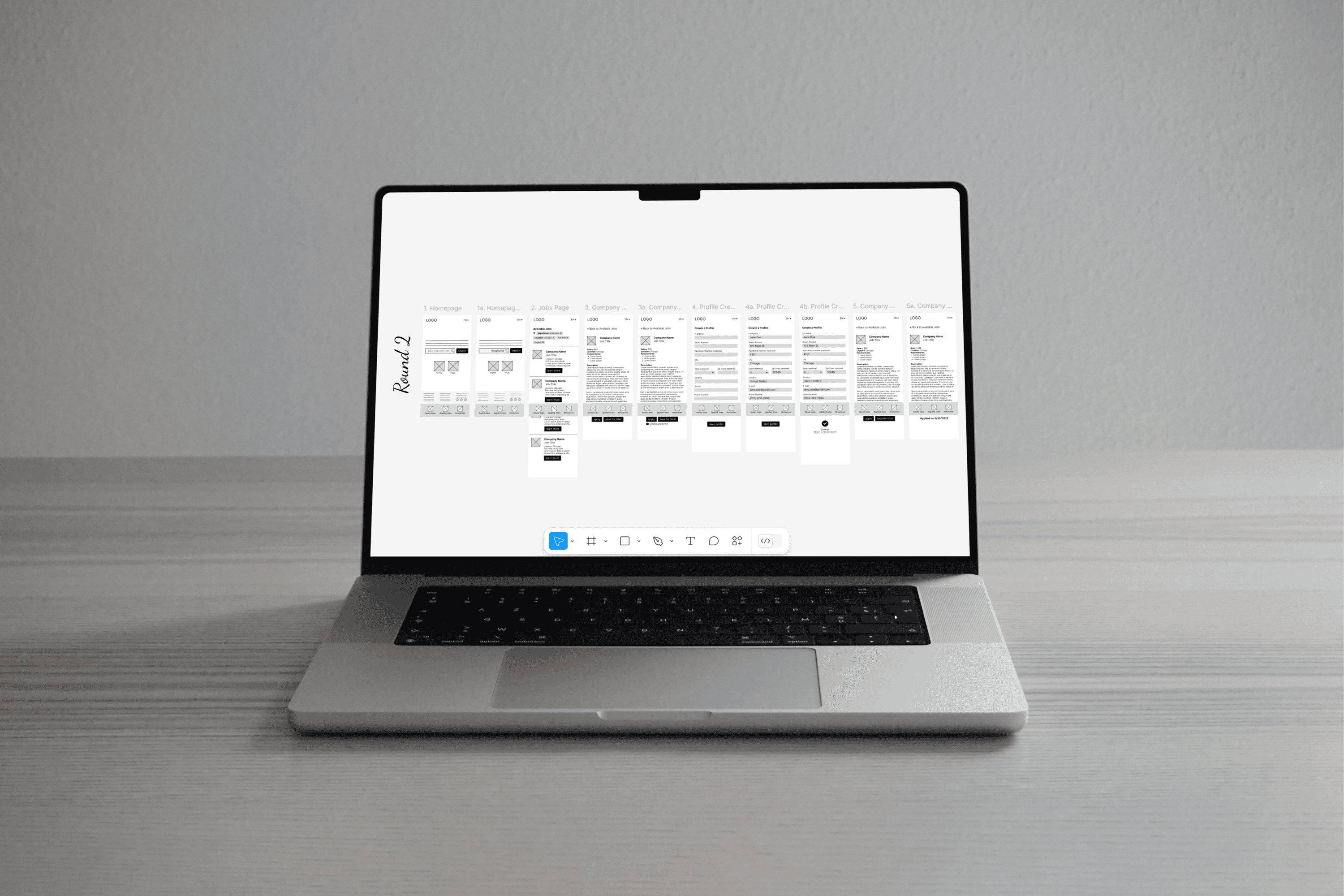
Paper Wireframes
Going into paper wireframing, I knew that there were three essential elements: the navigation, the search bar, and profile access. As I drew out each home screen option, I played around with the positioning of these elements, which led to a very streamlined final result, with the search bar front and center.
Digital Wireframes
Using the progressive enhancement method, I followed my paper wireframes with digital wireframes for First Gen’s mobile app. The design focused on accomplishing the main user flow (applying for a job) quickly and easily while maintaining consistency with what would become the desktop website.
Usability Studies
The first usability studies for First Gen were perhaps my favorite part of any Google coursework project. There was an “aha moment” as a participant suggested that users should be able to browse the website without signing in, and I realized that my mobile app design was really more of a mobile website design. That led to an organic discussion of what the differences between these designs should be, which in turn led to a totally new approach.
Findings:
Certain features, like the logo and navigation, were blocked and therefore unusable.
Users were unsure about the function of the home screen search box.
Some users didn’t see the benefit of the app, compared to the mobile website.
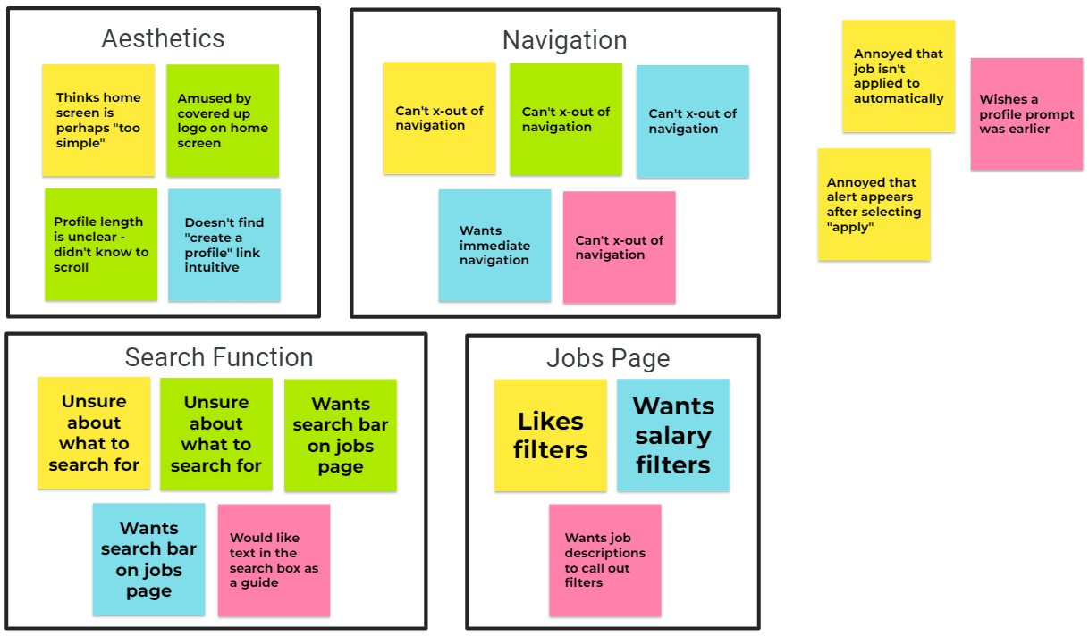
An affinity diagram following the first round of usability studies.
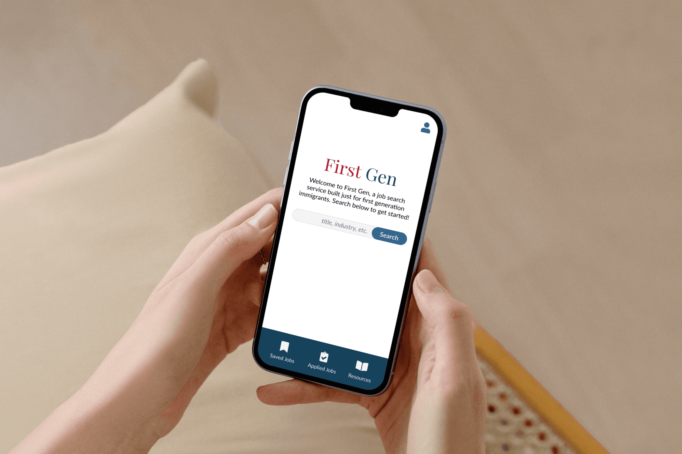
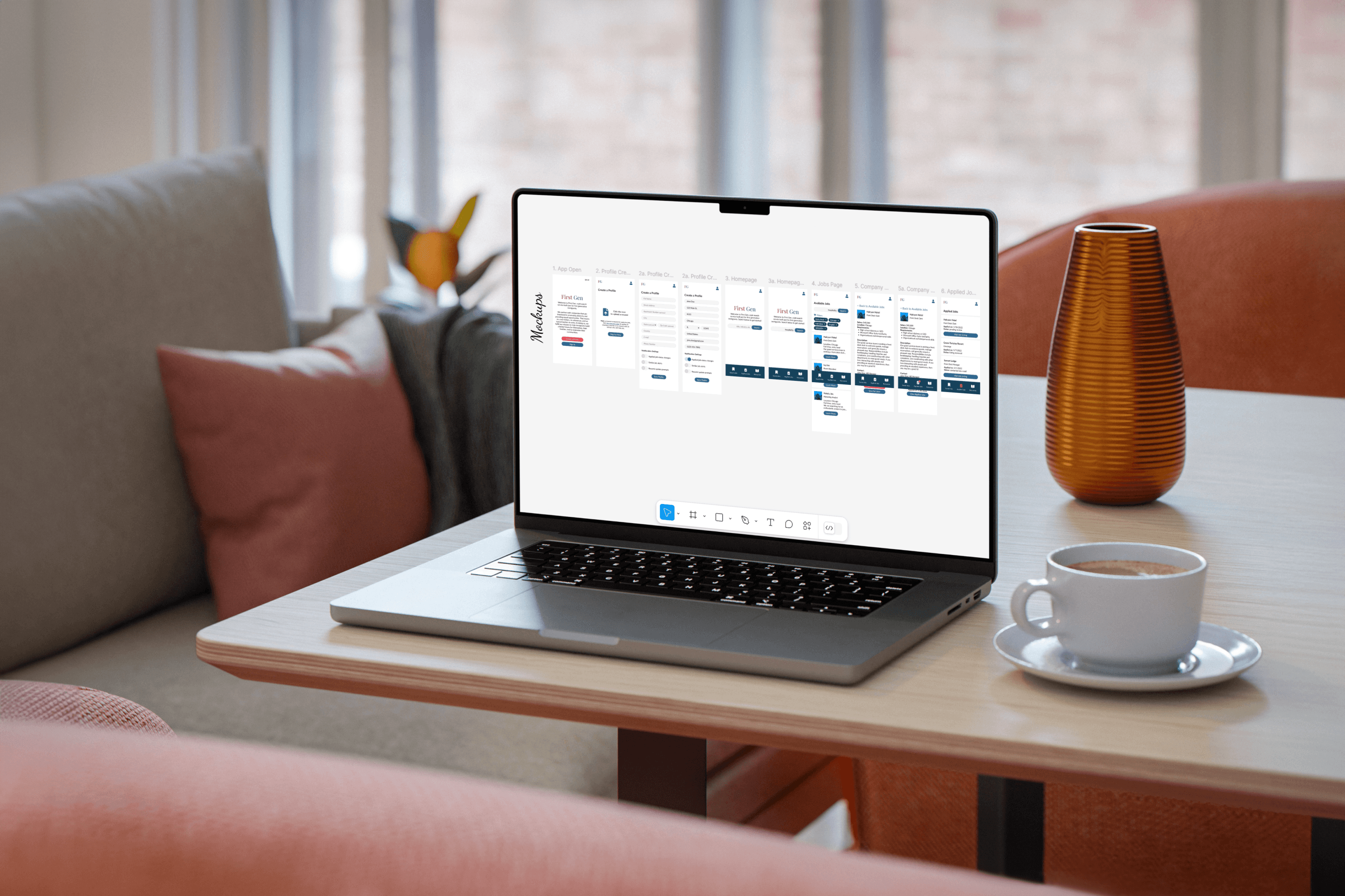
Mockups
I decided to simplify the app’s user flow by replacing a hamburger menu with a navigation bar. With this change, I also decided to prompt account creation or sign-in upon the app’s first start. In this way, the navigation would be more relevant, and the primary user flow of applying for a job wouldn’t be disturbed.
View my mockups in Figma at the following links:
Learnings
I ended up with designs for a mobile app, mobile website, tablet website, and desktop website. My goal was to create a cohesive experience, and I think I accomplished that well. Along the way, I learned:
Usability studies are king:
Although First Gen was my most thoughtful project, speaking to users about my lo-fi prototype brought up a host of issues and edge cases. These discussions taught me how sometimes you’re so close to a project that you need to be pulled back to consider the bigger picture.
Play to your (device's) strengths:
As I created different website versions, I challenged myself to maximize the benefits of particular devices. For the app, I considered the on-the-go nature of mobile phones and streamlined the navigation to reflect that. For desktop, I had more space to work with, so I learned how to create overflow layers within layers to present job listings and descriptions at the same time.