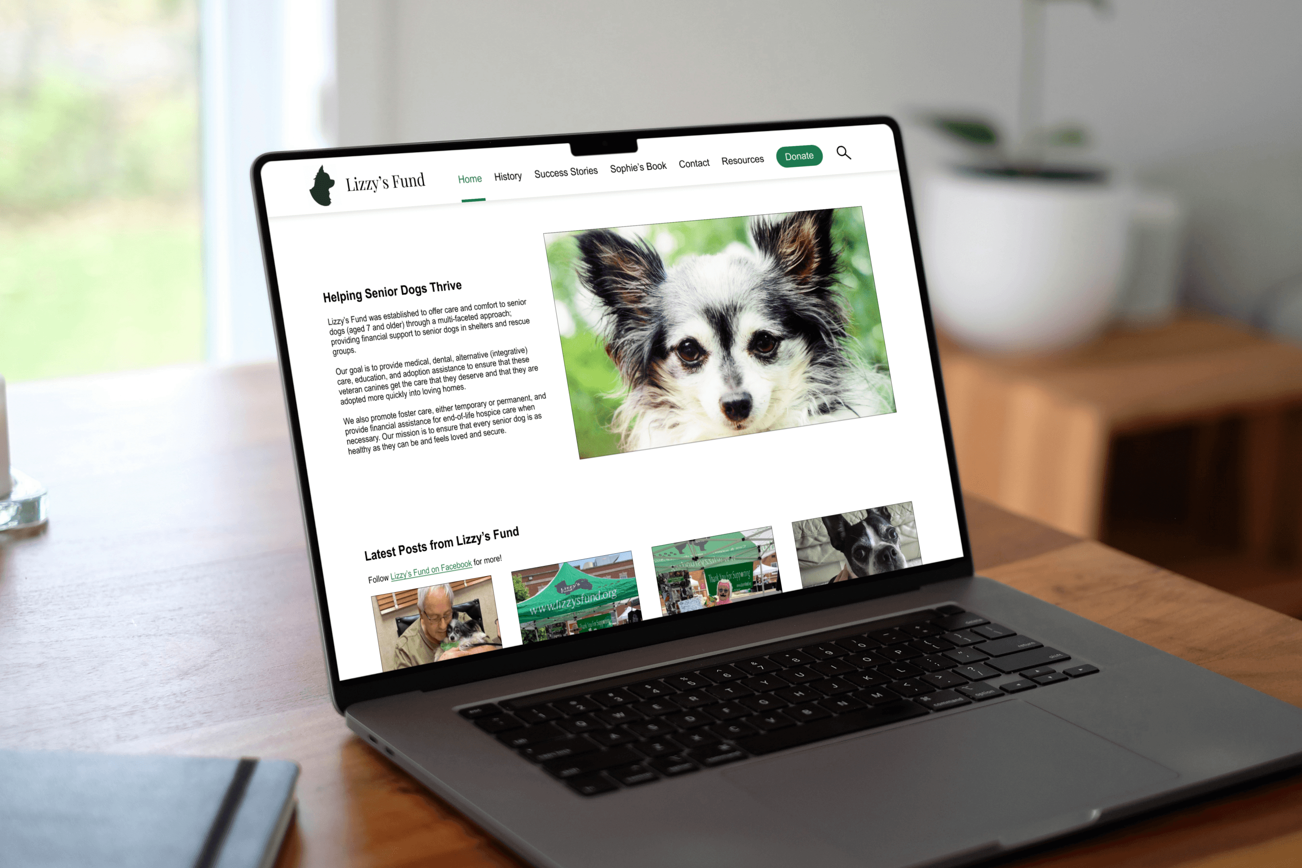
Lizzy's Fund Website
Duration
7 weeks
Category
Unsolicited Redesign
Project Overview
The Product:
Lizzy’s Fund provides financial support to senior dogs in shelters and rescues. It does so through medical care, education, and adoption assistance. Visit the current website here.
The Problem:
The Lizzy’s Fund website has opportunities for navigation, content, and accessibility improvements. Without these improvements, Lizzy’s Fund risks creating a negative user experience and alienating potential donors.
My Goal:
First, perform evaluations and tests to identify specific usability issues and to understand these issues from the perspective of real users. Then, redesign the website to be clearer and more accessible, which will in turn encourage users to stay, explore, and ultimately donate.
Research
Heuristic review:
To begin the research phase, I first reviewed the existing website through the lens of Jakob Nielsen’s 10 heuristics. Using this checklist of broad usability principles, I identified four overarching themes:
The website is not accessible from a keyboard navigation, screen reader, or color contrast standpoint.
Buttons are inconsistent and inaccessible.
The website’s simplicity makes it easy and efficient to use.
There is no help documentation present.
User surveys:
Next, I surveyed five family members to gauge perceptions of Lizzy’s Fund as is. These were the takeaways:
Users tend to do background research before donating to a nonprofit.
Users like knowing where their money is going, whether that’s through direct statements or success stories.
Lack of information deters donations.
Testing
Using the learnings from research, usability testing was conducted to better understand real user experiences with the current website. Users were given scenarios and tasks that covered common user goals: making a donation, finding contact information, reading content, and subscribing to the mailing list.
Takeaways:
9 tasks were tested, and 8 usability issues were uncovered.
Lizzy’s Fund has website pages that users find important, but the content on those pages can be improved.
Most participants took indirect paths to accomplish their goals, indicating that the navigation and wording have room for improvement.
Participants found the website “outdated” or “old-fashioned” and admitted that this affected their confidence in Lizzy’s Fund.
Addressing Major Issues
Below are the befores and afters of just a few usability recommendations. View the full final prototype in Figma here.
Issue 1:
The issue: unclear navigation
The fixes:
Move outdated pages to the end of Resources
Rename the link for Lizzy Talk to “Newsletters”
Convert the Donate link into a donation button
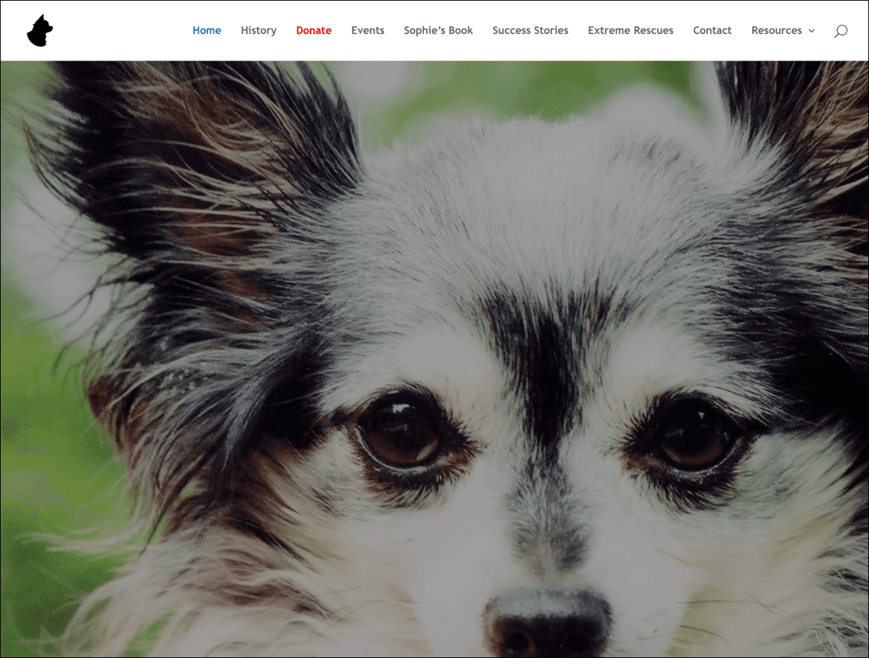
Current website (as of 2024)
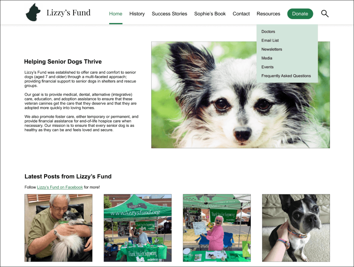
Prototype, with a Donate button, Newsletters link, and reorganized resources
Issue 2:
The issue: inconsistent buttons
The fix: use consistent, text-based buttons with at least a 3:1 contrast ratio
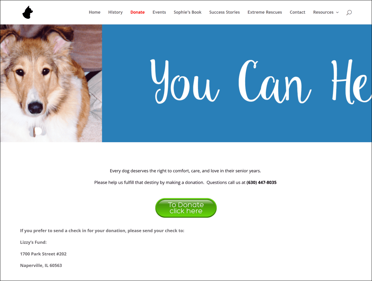
Current website (as of 2024)
Prototype, with consistent text-based and high-contrast buttons
Issue 3:
The issue: lack of help documentation
The fix: add an FAQ page
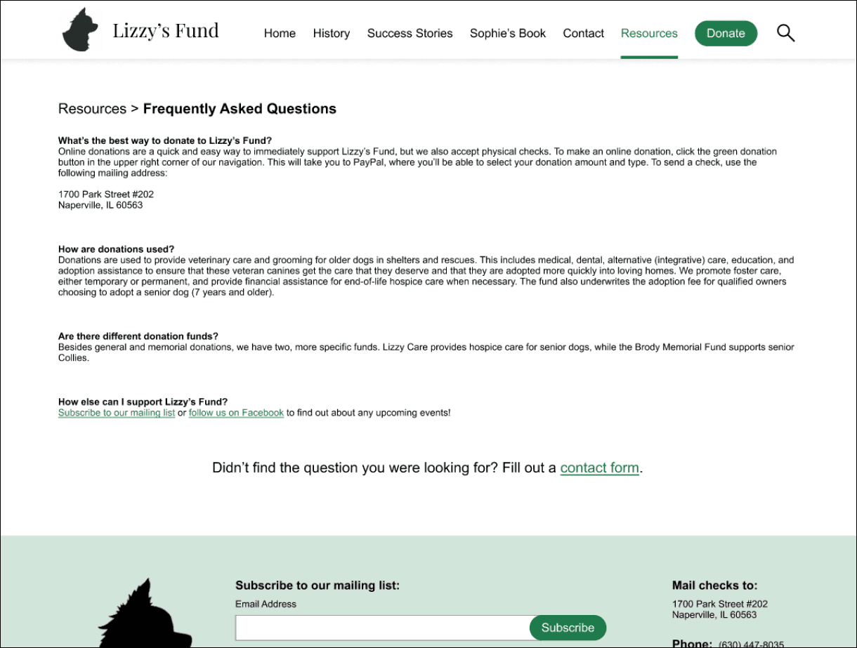
Prototype of a new FAQ page
Learnings
This was my first project with a real website and feedback from a professor and fellow students. It validated my passion for UX, and it taught me to…
Establish priorities:
After conducting usability studies, I was left with 3 high priority, 3 medium priority, and 2 low priority issues. Ranking issues was actually really helpful, because it gave me next steps and a rollout plan. Realistically, not all recommended changes can be implemented at once, so identifying major issues and tackling those first can have a great impact.
… but prioritize content:
Many of Lizzy’s Fund’s “fixes” involved tweaking the content. Whether renaming navigation links or adding entire pages, a website is only as useful as the information on it. This project was a good reminder that UX is much more than just the visual aspect.